
The Visual Representation
of your Brand
Creative Design Principles from The Phoenix
Creative Design Principles from The Phoenix
At The Phoenix, whenever we approach a new branding project, we first analyze the desired and projected Brand Personality, the Brand Essence and the characteristics of the Target Consumer. It’s not that a single element of the Visual Identity, like a website for instance, is incapable of expressing the precise sentiment that the Brand wants and needs to communicate, but rather that each element used in its communication is in effect, part of a larger orchestra. As such, if one of the instruments is out of tune, even slightly, the music just doesn’t sound as good.
Brand Visual Identity
In general terms, the Brand’s Visual Identity expresses its values, personality and its objectives. It includes the name, logo, fonts, colors and imagery. These elements belong in your “Brand Orchestra” and if they are not present, your Brand may be out of harmony.
The logo is one of the most powerful and important elements of a Brand’s Visual Identity. Therefore, we exhaustively audit the Brand, the industry segment where the Brand will compete and the traits and habits of the Target consumer before we begin creating a new logo. At the same time, we consider how the entire visual identity, including brand name, colors, typography and imagery will interact with the Brand personality.
"The brand is a promise. If you don’t trust the promise, then it’s of no value. So, trustworthy promises – make credible brands, make powerful brands, make strong market positions…. People are willing to pay a premium for a promise, they believe in"
— BJ Cunningham
Brand Name
When it comes to developing a name for a Company or Brand, The Phoenix analyzes four distinct categories:
1. Experiential: Direct context to the function of company or brand. Examples: Target, Safari
2. Functional: The Company/Brand describes the products. Examples: Subway, Hotels.com
3. Evocative: Reinforces Brand personality & positioning. Examples: Amazon, The Body Shop
4. Invented: Creates a sense of uniqueness that help to set it apart from the competition. Examples: Google, Twitter
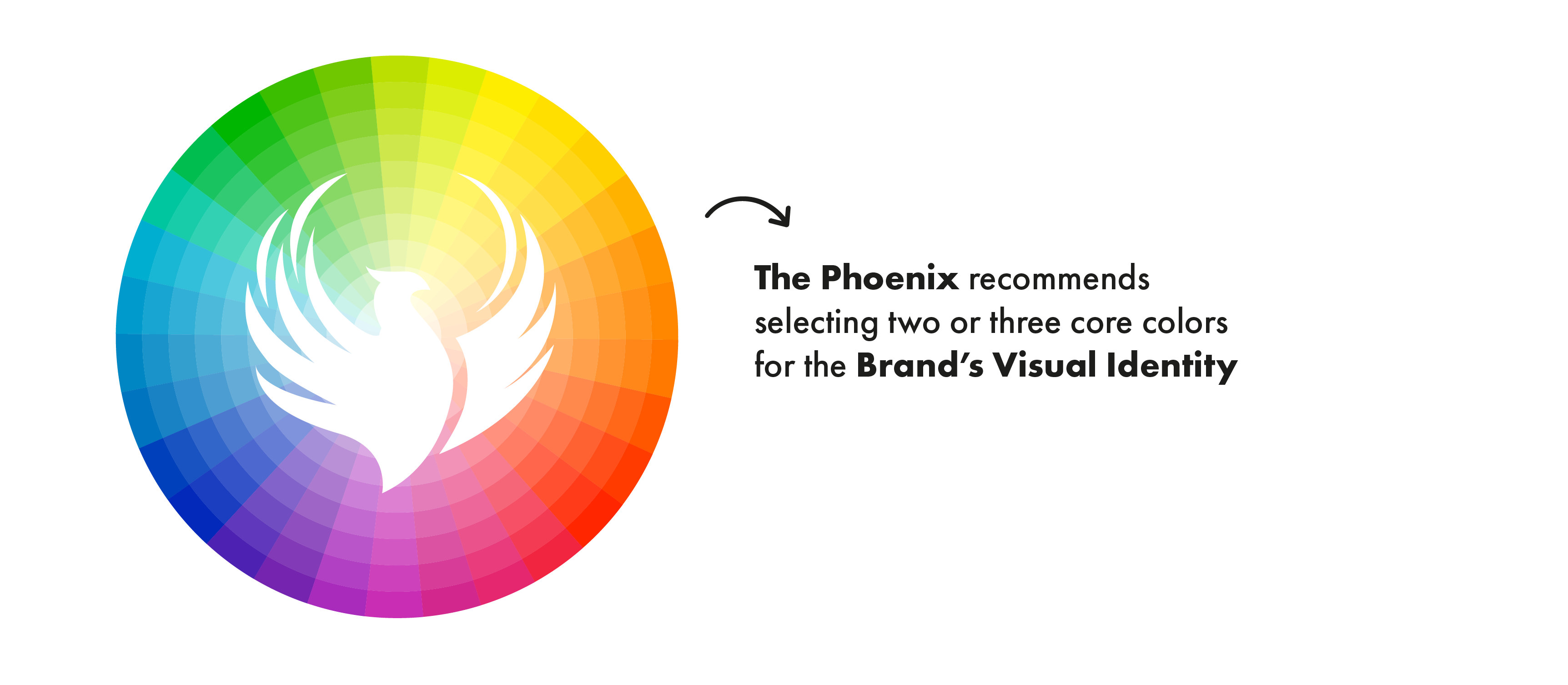
Colors
Color plays an important role in how Brands are perceived. The Brand Color Palette is not about what it is personally appealing but is designed to help to define and express the principles of the Brand. Whether it is a CPG Brand trying to connect to younger adults or a non-profit organization aiming to strengthen their image in the community, the psychology of color can be used to help build a strong, relatable brand.
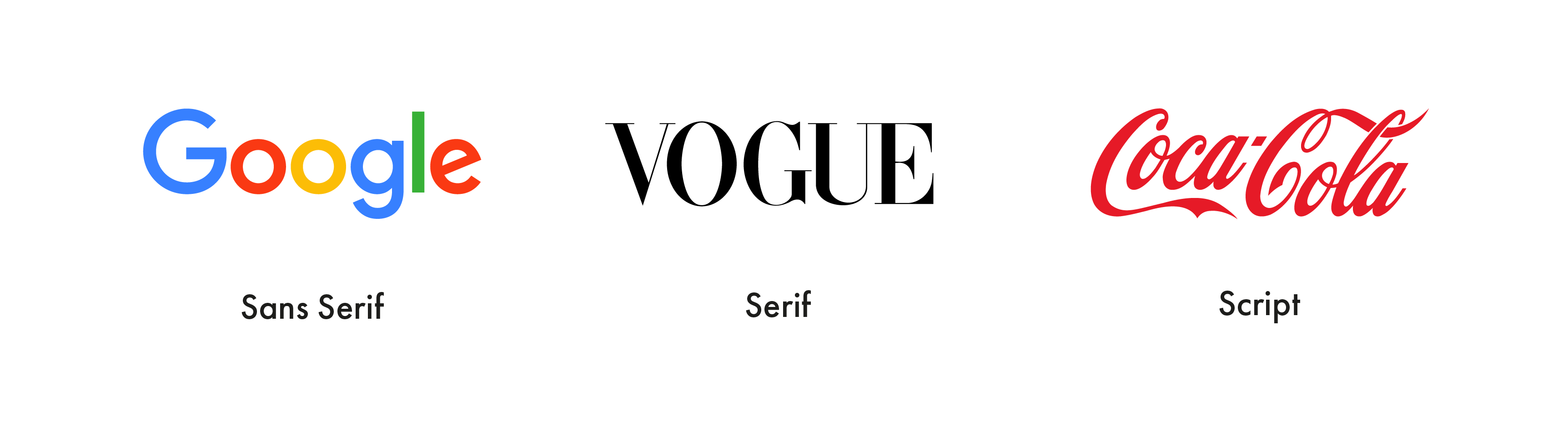
Typography
Typography is a visual art form that creates the framework for the Brand communication. Carefully selected typography is used in everything from logos and taglines to headlines and body copy.
There are literally thousands of font styles that are readily available to choose from. A custom font that is ownable by the Brand can also be created by The Phoenix’s design team to better align with the Brand’s personality.
Imagery
Every Brand should have a clear set of rules for image selection, treatment and usage that are in-step with the Brand Personality and overall Brand Essence.
Decisions on whether imagery should be real or an illustration, with or without color effects or other artistic touches, or whether it should appear polished, high-quality are necessary. These guidelines will ensure that visual communications are always aligned with the Brand’s Personality.
Logo
When it comes to logo creation, there are 5 key principles that The Phoenix uses as a litmus test for effective logo design. A logo should be:
1. Simple
2. Memorable
3. Timeless
4. Versatile
5. Appropriate

Website Design
Websites are a digital extension of the visual representation of each Brand. At The Phoenix, when designing or redesigning websites for our client partners, we use a process similar to the creation of a Brand’s Visual Identity. Our overarching principle in website design is that usability and functionality. UX or User Experience, must drive each decision and outweigh any other design consideration.
It is also paramount to consider the industry segment the Brand belongs in, the Brand’s Target Consumers most important demographic and psychographic characteristics and how they are most likely to engage with the Brand. What User Interface (UI) is preferred? Or more simply put, would the Consumers be more likely to interact on mobile (small screen) or desktop (big screen)? How are the Consumers going to navigate around the website through the internal page hierarchy? How long are they likely to stay on the website? Is it rich with multimedia content?
In order to keep your Consumers coming back (and sharing) your website, there are two imperative requirements: 1. A well thought out User Experience (UX) and 2. A visually appealing and engaging look and feel across all User Interface (UI).
At The Phoenix, we combine our expertise in Brand Strategy with our talent in creating exceptional designs that create memorable and effective Visual Identities and their many extensions. Your Brand orchestra needs the Visual Identity instruments to be polished, in harmony and in sync to play the songs your Consumers will mark as favorite in their playlist.