

The Phoenix wins THREE MUSE Awards!
The MUSE Design Awards honors design professionals who, despite being mired in uncertainties and hopelessness, march on and remain true to their works.
The Phoenix wins THREE MUSE Awards!
Taking over 5,000 entries from all over the world, the MUSE Creative Awards has demonstrated to be one of the leading programs in honoring excellent individuals in the creative and design fields.
The MUSE Awards honors those who are dauntless in adversity; who take on challenges with an unwavering will. Those who set the standards for the world and inspire others to reach higher. A MUSE sees their goal and looks ahead. Their intent remains unadulterated and pure, staying true to the essence of its owner. No adversity is too great to overcome, nor too complicated to comprehend.
The Phoenix is proud and honored to join this prestigious group of award winners for THREE different works in 2020 on behalf of our clients.
Magtoff Vodka
CATEGORY: PACKAGING DESIGN - WINE, BEER & LIQUOR
The Packaging Design of the Year award represents more than just boxes and bags. Truly great package design advances the graphics, branding, presentation and materials that make a package iconic. After conducting an in-depth Brand Development, which included internal and strategic sessions with the client, The Phoenix created the Brand Visual Identity for the Magtoff Brand which included the design for the bottle and case.
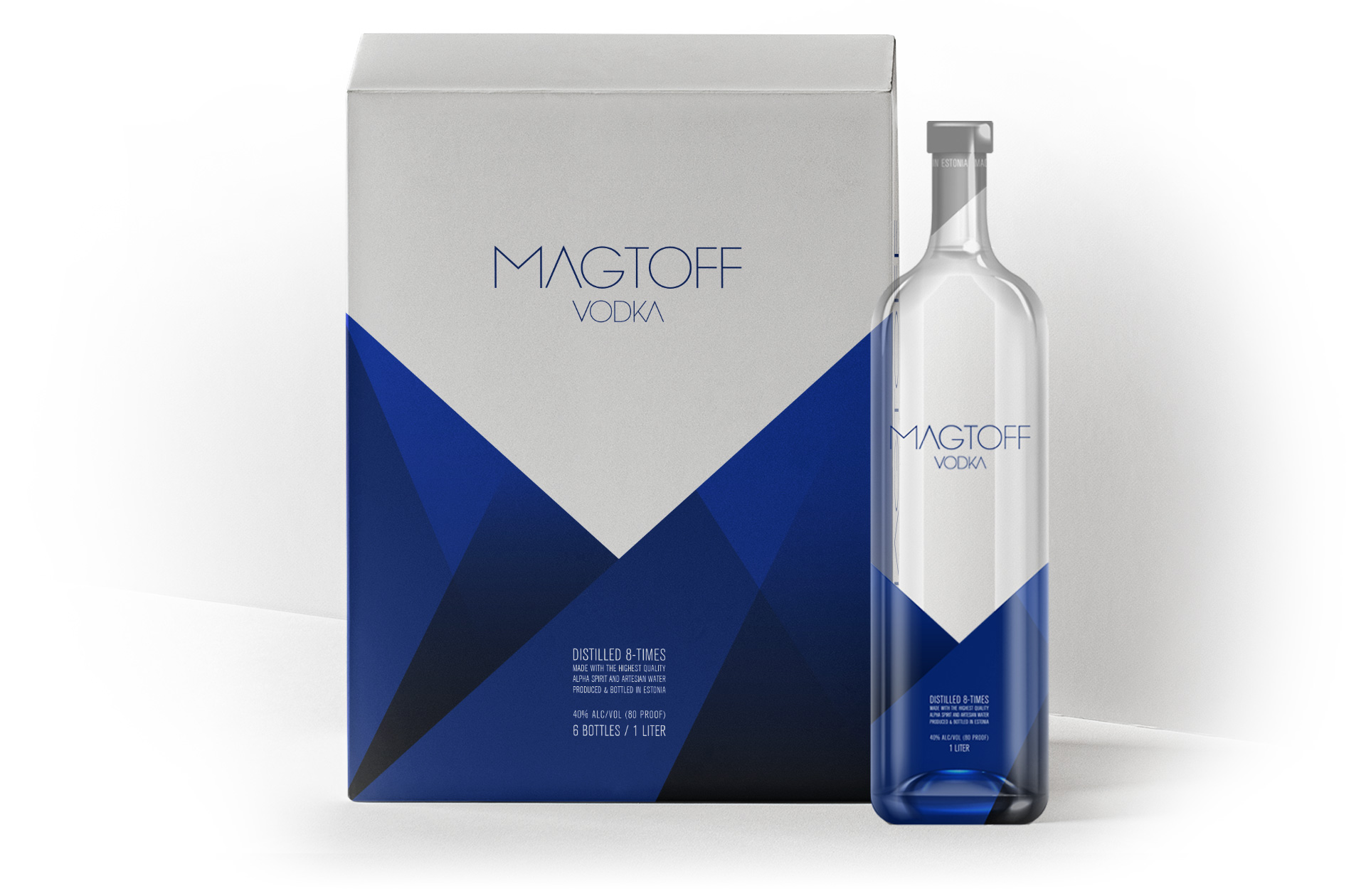
Magtoff Vodka
CATEGORY: CORPORATE IDENTITY - LOGO
This award recognizes corporate or company material that specifies how the company is to be represented in the eyes of the rest of the world. The Brand Visual Identity for Magtoff included the color palette, unique typography and an iconic logo the Brand will use on its packaging and communications.
KuriosEd
CATEGORY: CORPORATE IDENTITY - LOGO
.The Phoenix designed and facilitated a multi-day Brand Development and Brand Strategy session with EdChoice and key leaders of the faith-based organization, KuriosEd. The insights derived from the Brand Strategy sessions were essential in the development and implementation of the Brand’s Visual representation.
The Phoenix designed simple, memorable, and versatile elements to represent the KuriosEd Brand and the organization’s commitment to education and community.
The Phoenix designed a logo that evokes an open book to signify education, knowledge and wisdom. The turning pages represent access to more, and knowledge gained when educating oneself. As the pages continue to turn, they turn into “KuriosEd”.
Visit the MUSE Awards to check out our work and the other incredible award winners!